Microsoft is guilty of numerous UI crimes from over the years. The "Ribbon". Metro Tiles. Centre-justifying the taskbar. But for me, all of these pale in comparison to what is, for me, one of the most annoying things they have ever done. And that is the introduction of these buttons:
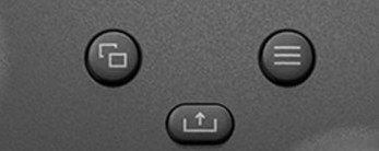
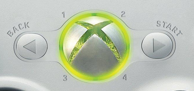
If you don't recognise those buttons, they're right in the middle of a modern-day Xbox controller. Introduced with the Xbox One, they replaced what used to be there, which is this:
I'm sure you can see what the issue is with the top set of buttons, but in case you can't, there are numerous problems.
Firstly, what the fuck are any of them called? I bet you don't know without looking them up. I don't even know what the middle one does, and that icon isn't much help either. Is it for removing liquid from a container? Fuck knows.
Secondly, if you can't remember what either of them are called, this makes it infinitely harder to remember which way round they are, necessitating you look at your controller any time you are asked to press them. This is not a problem that the Xbox 360 layout had, since the buttons themselves had helpful arrows indicating which side they were on. And they had the names of the buttons on them too. We'll leave aside the unnecessary replacement of the conventional "Select" with "Back" for the moment.
Thirdly, if you are using an older controller that still has Xbox 360 button labels on it, but a game insists on using the newer Xbox iconography, it's really hard to know which one you're supposed to press, particularly if you've never had an Xbox One/Series controller in your hands before. This, again, is not a problem that the Xbox 360 layout had, all because of those simple little arrows.
Part of the problem with the newer buttons is that they assume consistent functionality. The one with the three lines is called the "Menu button", and makes the assumption that any time you press it, a menu will appear. This is not always the case, however; sometimes it might pause a game or a cutscene, sometimes it might be used to start a game, sometimes it might do something extremely specific that is only relevant to a single game.
Likewise, the button with the two overlapping squares is called the "View button", and even Microsoft's own website doesn't have a good explanation for it, saying only that "the button's functions vary depending on the app or game." There's no real reason for it to be called the "View" button, because, as Microsoft themselves say, there is no fixed purpose for it. Much like the "Menu" button, it can have all manner of uses, many of them having nothing to do with the word "View" whatsoever. (As an aside, the above link doesn't even mention the middle one, either. So maybe Microsoft don't know what it does, either.)
One could argue that these criticisms could quite reasonably be levelled at the "Start" and "Back" buttons also. But there's an important difference: up until that point, it had been standard convention for a controller to have, at the very least, a "Start" button, and often a "Select" button also.
And the uses for those buttons had remained both pretty constant over the years and relevant to the button names: "Start" had always been used to start games, like a Start button on an arcade machine, and had also been used for pausing (in fact, the Nintendo Gamecube had specifically labelled it "Start/Pause") and then starting them again after you paused them. "Select", meanwhile, used to be the button you used to toggle through selections on a menu — this is most commonly seen in old Nintendo games — before it was decided that navigating using the directional pad made more sense, particularly in more complex menus.
Microsoft's "Select" replacement "Back", meanwhile, while not always used to "go back", often was used in that way in Xbox software, thereby giving it 100% more practical use than a "View" button that its own manufacturer admits doesn't have anything to do with viewing things.
While we're on the subject, I'm not a huge fan of Nintendo replacing "Start" and "Select" with "+" and "-" either, but at least those make a sort of logical sense; "+" is on the right while "-" is on the left, reflecting how you would expect to see a line of numbers presented, with smaller ones on the left and larger ones on the right. We'll leave aside the fact that these buttons are very rarely used to increase and decrease values in Switch software, and instead are used as, you guessed it, pretty much what the old "Start" and "Select" did.
I'm sure someone somewhere thought they had a really good reason for changing the Xbox buttons to what they are now. But they suck. They always have done, and every time I play a game with my (still working) Xbox 360 controller and have no fucking idea which button I'm supposed to press because I can never remember which way around the stupid Menu and View buttons are because my controller doesn't have them, it's immensely annoying. Kudos, then, to those developers who bother to put in different options for button labels according to Xbox 360, Xbox One, PlayStation and Nintendo conventions, then. You guys are unsung heroes.
That has been your pointless rant of the day. Yes, I know the United States is imploding and something something Ukraine, but I was just reminded of these stupid-ass buttons today, so I felt like having a good old whinge about them. You may now return to your previously scheduled Sunday of wasting time on the Internet.
Want to read my thoughts on various video games, visual novels and other popular culture things? Stop by MoeGamer.net, my site for all things fun where I am generally a lot more cheerful. And if you fancy watching some vids on classic games, drop by my YouTube channel.
If you want this nonsense in your inbox every day, please feel free to subscribe via email. Your email address won't be used for anything else.
Discover more from I'm Not Doctor Who
Subscribe to get the latest posts sent to your email.